
The beginning
This project came out of a 36-hour hackathon themed "AI: Adaptation or Mitigation." We chose adaptation, building a visual language that gives users at-a-glance statuses across key areas of their lives.
We heat-mapped three core areas: calendar activity, money spending, and physical activity. Data is pulled from apps users already rely on, like Outlook, Gmail, Strava, Apple Health, and bank accounts. All synced during initial setup.
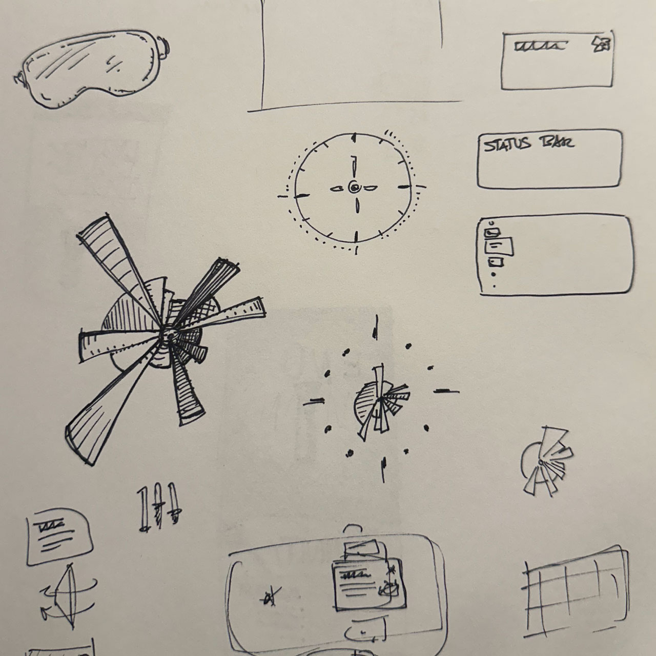
We designed for Apple visionOS, exploring formats like plotter maps and bubble charts before landing on a pie chart-based interface with results displayed in a console panel.
A few months later, I revisited the idea to see if it could work as a real product. What you're about to see is the MVP1 design of the Glance app, built for Apple Vision Pro.
The proof of concept
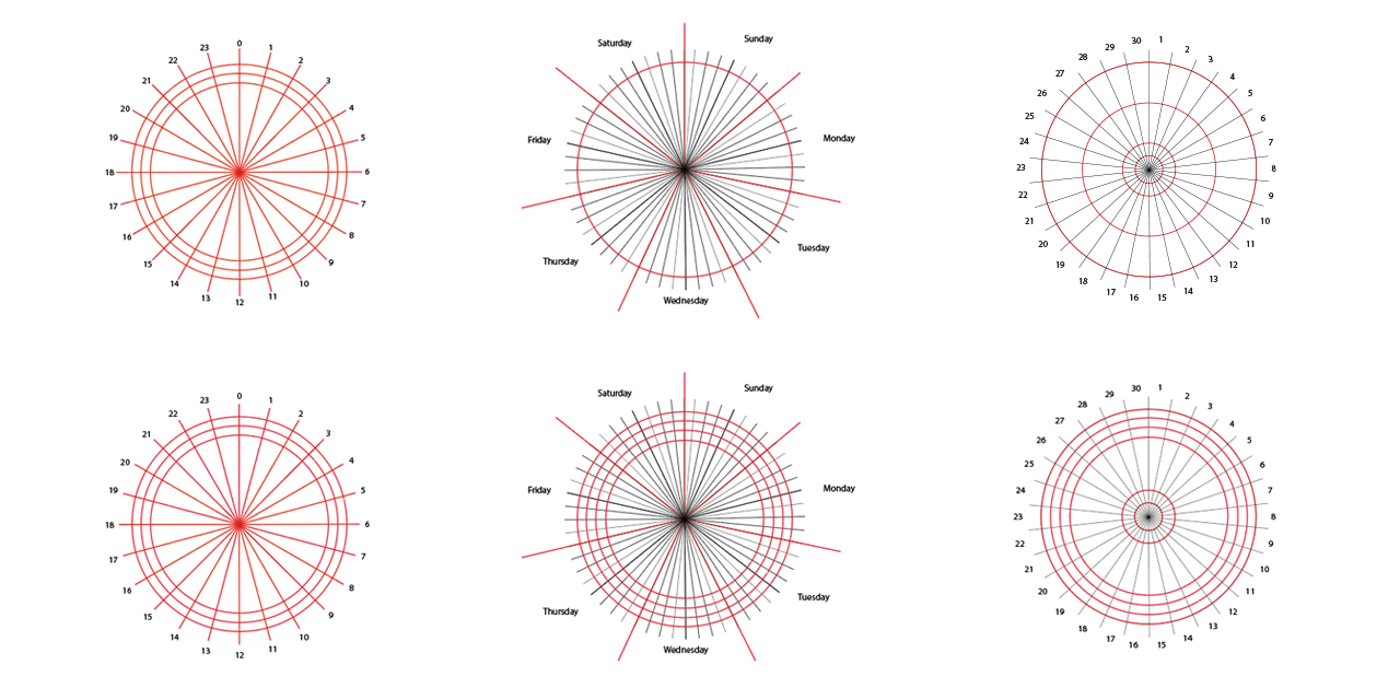
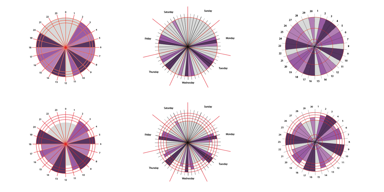
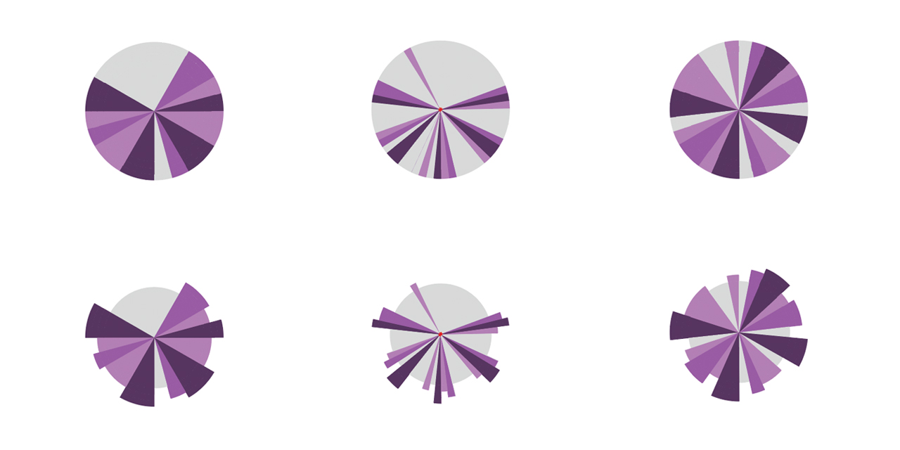
Before diving into the user interface, I needed to determine whether using the pie chart as a heat map for the different iterations of a person’s calendar was viable.
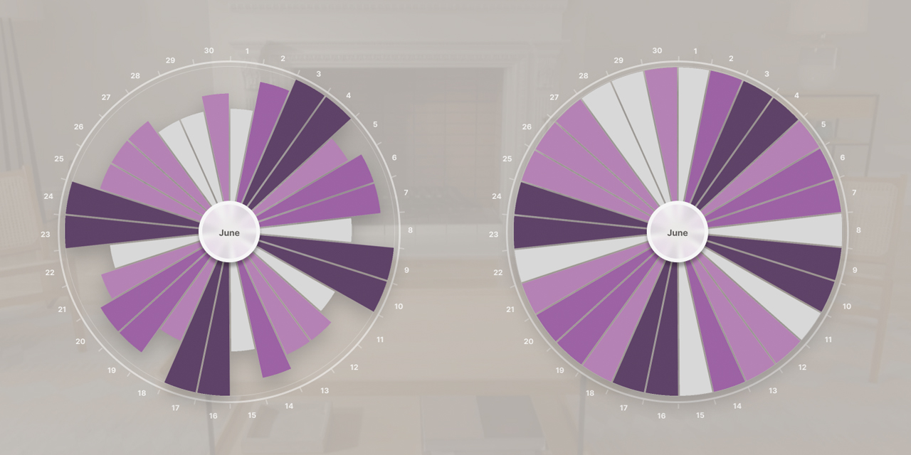
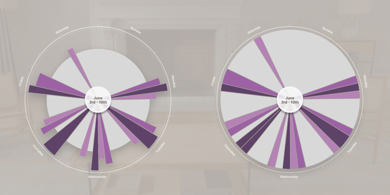
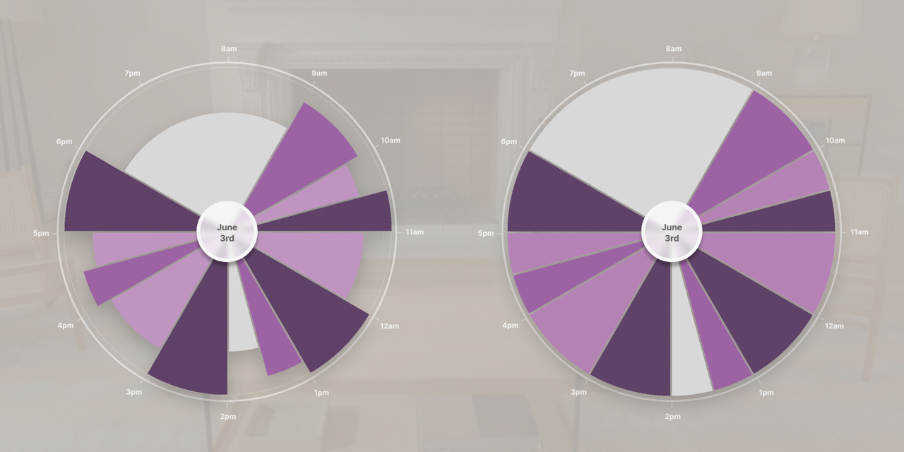
I decided to consider a person’s day, week, and month views. I needed to figure out the chart intervals while also adding a layer that conveys event importance, including meeting priority and density through different segment sizes and colors(Fig.3 to 5).
In the end, the visual difference between the day, week, and month patterns were enough to convince me that a consistent visual language was achievable: one that allows users to view their schedule and quickly register busy, quieter, and open portions of their day, week, or month at a glance.
The experience
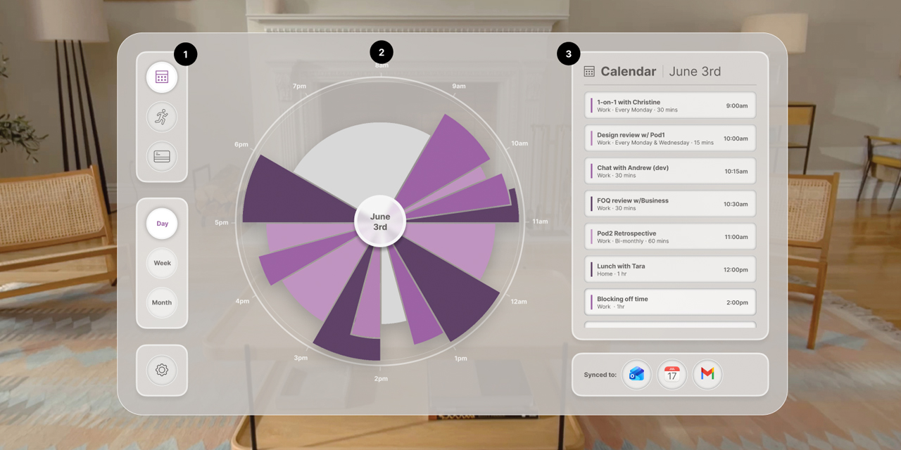
The MVP1 experience lives within the visionOS world. The design has three main persistent sections that change depending on the context the user is viewing (Fig.6).
1) The first column contains three properties/navigation items: the category selector, the context selector and general settings.
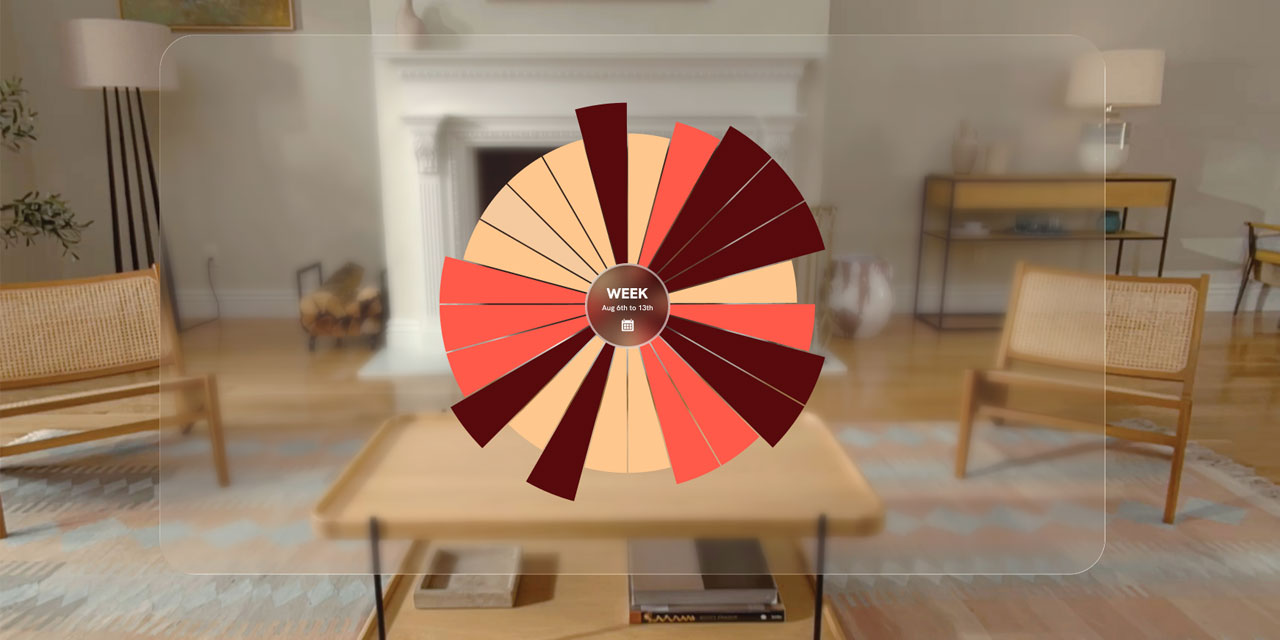
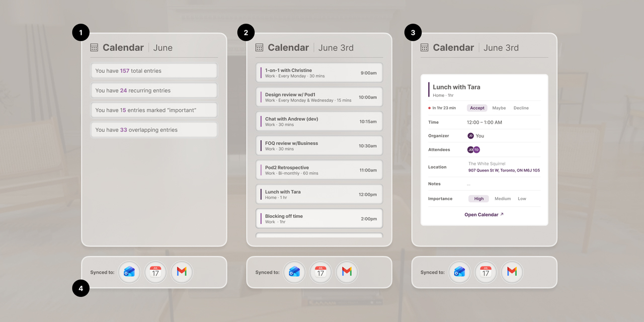
2) The middle column houses the heat map, displaying the key visual graph — in this instance showing the “work day” view. Along with the heat map, there is labeling surrounding it that provides reference to the timing of all events.
3) The last column is the details panel. The main thesis of the app is to give the user an instant status of their day, week, or month, but the utility of that alone is limited and needs to be reinforced with more actionable information. The details panel holds content related to the context of the heat map, plus the list apps that supply the information.
The UI | Side nav
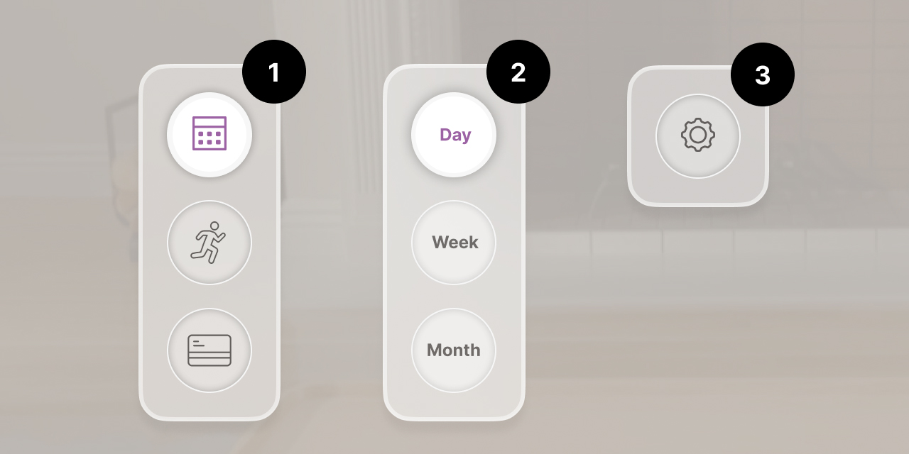
The side navigation houses three key elements.
1) The category selector allows the user to choose which category is displayed in the heat map, the Calendar, Activity Monitor, or Money Monitor.
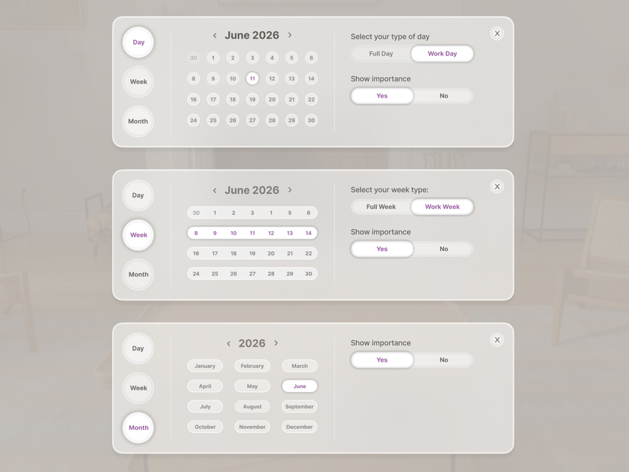
2) The context selector lets users switch between day, week, and month views. When selected, it opens an expanded panel (Fig.8) that focuses the user on a specific time frame, whether they want to view their full day or week, just the work portion, and whether they want the heat map to visualize event importance through segment size.
3) The settings area is a place to store any general preferences.
The UI | Heat map
The heat map chart is the key to the application. Color-coded and variably-sized segments show the user high-importance events (or a high number of meetings, depending on the context), as well as medium, low, and open times throughout their day, week, or month. The user can select any segment and the relevant information will appear in the details panel.
The user also has the ability to view the heat map with or without the size filter applied. The size filter adds a visual cue that helps the user identify when a time period is particularly busy or important. All categories follow the same brightness hierarchy to indicate the significance of a given segment:
1) Dark purple/large segment = High importance / multiple events
2) Medium purple/medium segment = Medium importance / multiple events
3) Light purple/small segment = Low importance
4) Grey = Schedule is open
It’s worth noting that the size and color filtering would not rely on static classifications. It would dynamically take the busiest and most important portion of a given time window and use it as a baseline against which all other levels are measured.
For example, in a weekly view, if the 1-4pm segment has five meetings with two classified as important, and the 4-7pm segment has three meetings with two classified as important, the 1-4pm block would be marked dark purple, while the 4–7pm block would appear one shade lighter.
The UI | Details panel
The details panel gives the user a detailed reference for what they’re seeing in the heat map.
There are three general views:
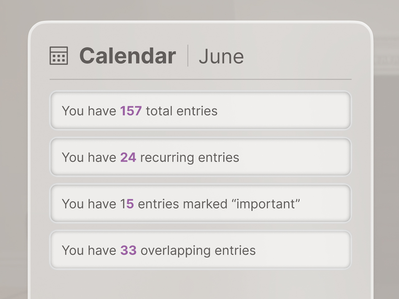
1) The synopsis view: when the user is viewing a monthly overview, this shows a list of categories and the number of events within each. (Fig.13)
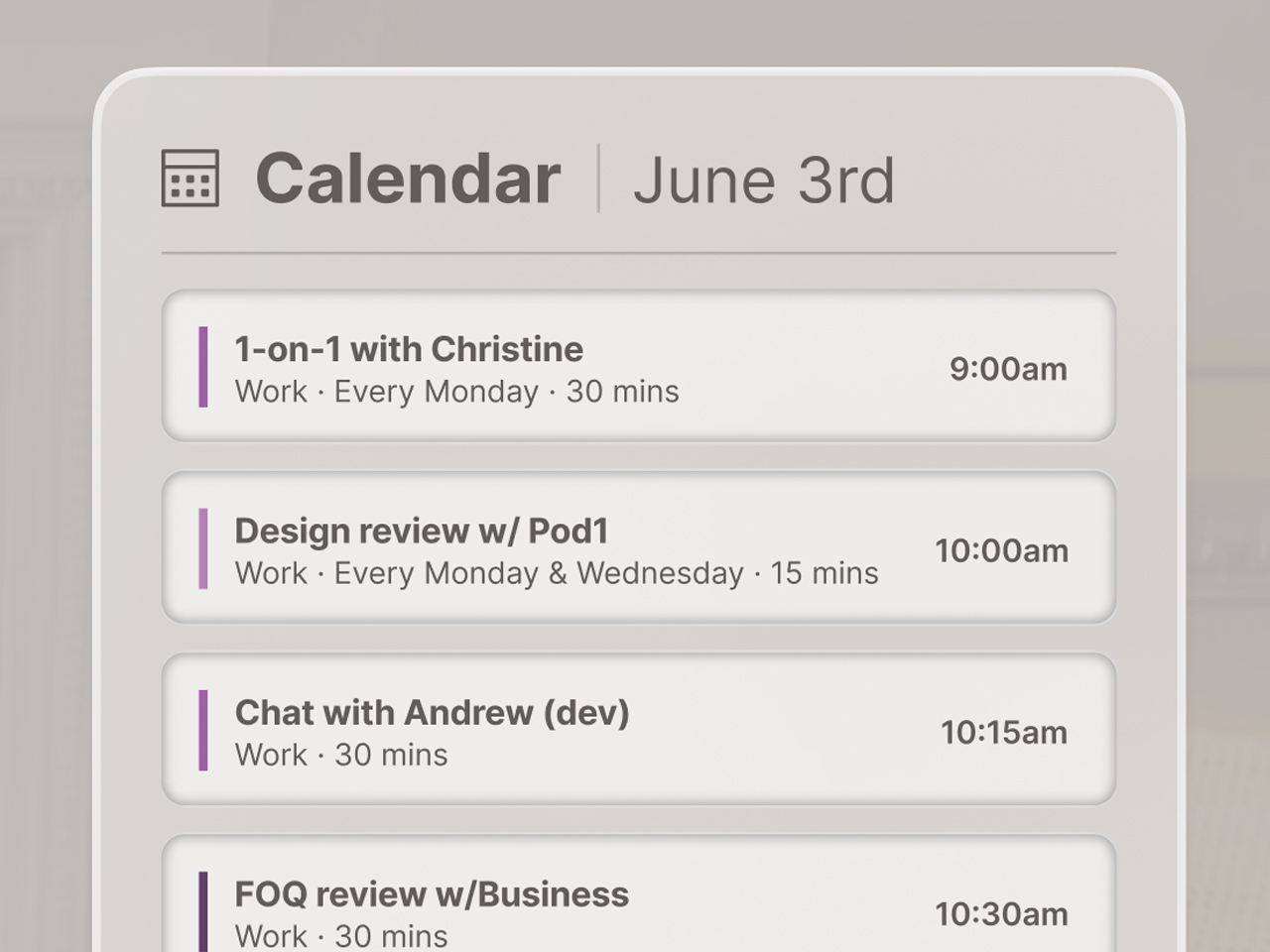
2) The listing view: when viewing a weekly view or a high-density section of a daily view, a list of events is displayed for the user to review. (Fig.14)
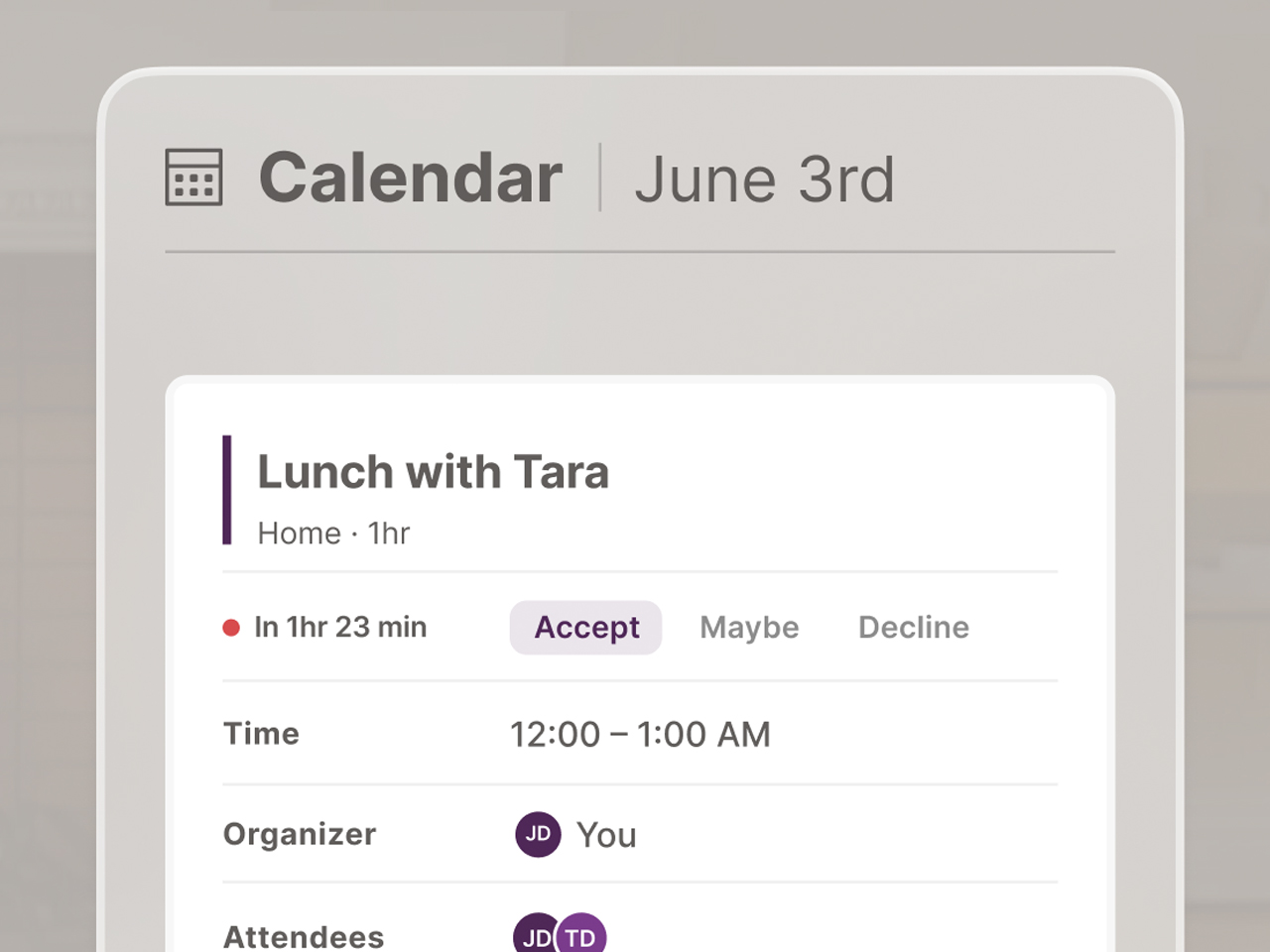
3) The specific view: this shows the full details of an individual event. (Fig.15)
Below the details panel a static list:
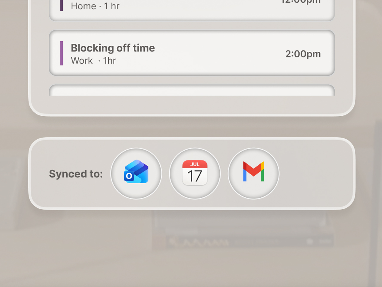
4) This section shows which apps the heat map was aggregated from. (Fig.16)