TD Insurance
Intro
The majority of my time at TD was spent helping grow the insurance platform from its humble beginnings to a force that accounted for almost 50% of policy bindings.
The main challenge we faced was balancing the amount of information we needed to show (both for comprehension and legal reasons) against the amount that could overwhelm the user and lead to information overload.
Instinctively, you'd think less is more and the simpler the better. But through years of user testing, a pattern emerged: too little information made customers uneasy. They felt like something was being hidden from them and that they were missing something important.
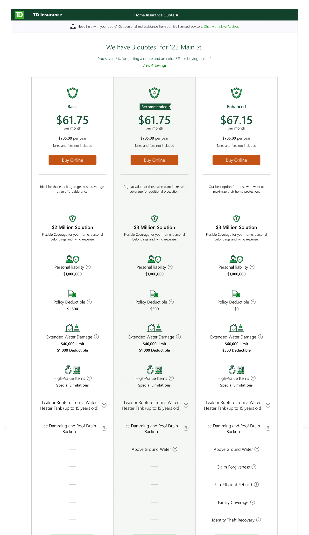
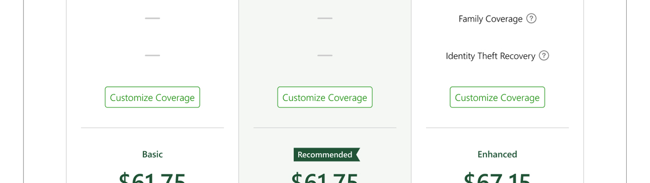
One way we solved this was by separating information into constructs that felt relatable. The three-offers page (Fig. 1) is a common pattern seen in e-commerce. Along with giving customers options, it also provided the opportunity to highlight their coverages and create a beachhead they could use to explore further, in this case by selecting a "Customize Coverage" option (Fig. 2).
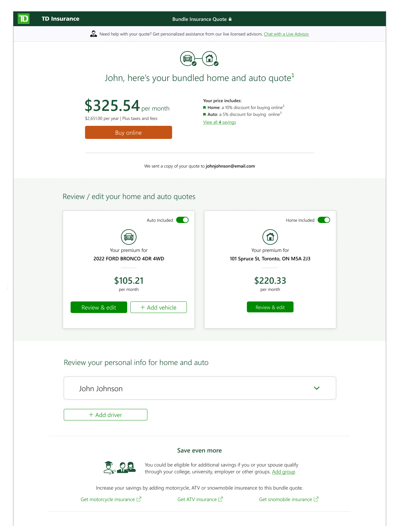
In the case of the home and auto bundle quote (Fig. 3), we took it a step further and simplified the view down to just price and discounts. This allowed customers to absorb the price benefit before committing to learning more.
Minimizing the user's load
Reducing mental load wasn't always straightforward, and we turned to other approaches to chunk out the information being shown. Below are a couple of examples that represent the thinking applied throughout the TD Insurance quoters.
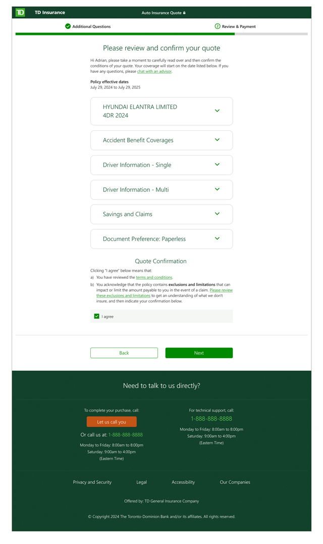
One example is the policy summary page (Fig. 4). This page includes all the details a customer would receive in their insurance policy package — coverages, personal information, liabilities, and so on. A comprehensive list that only grew over time (due to legal requirements) needed to be digestible online. Scannability was important for usability, but nothing could be left out, so the solution was organizing and collapsing the content into categories (Fig. 5).
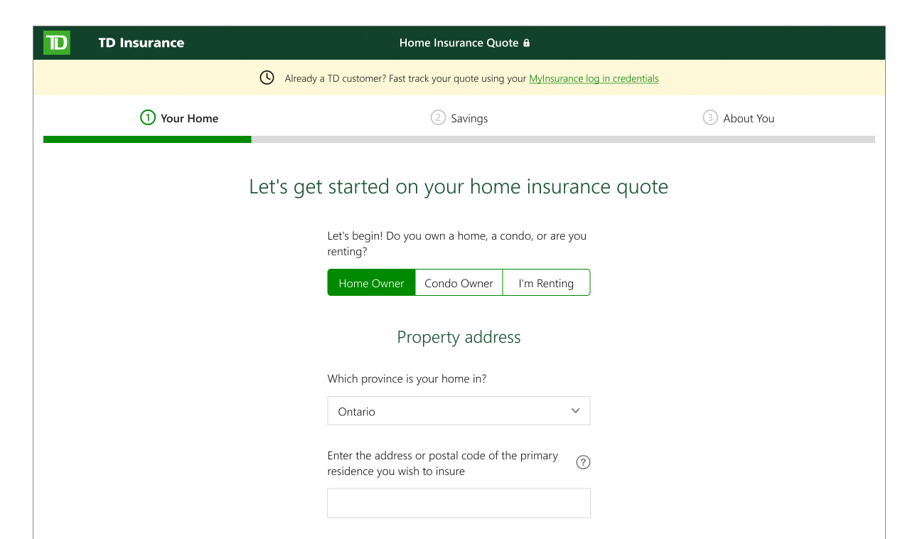
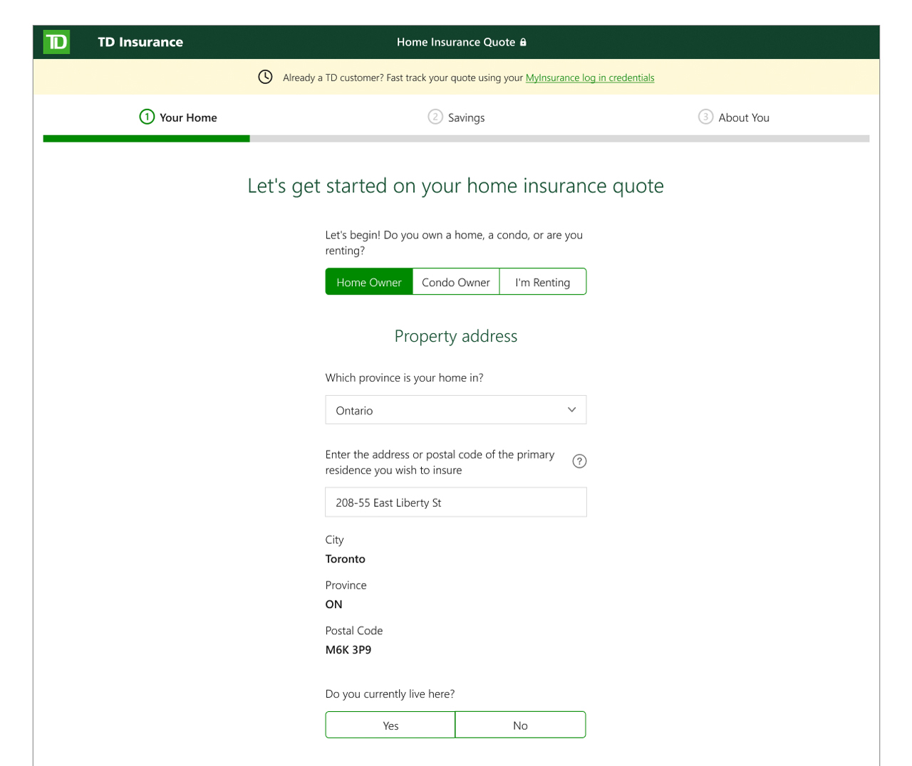
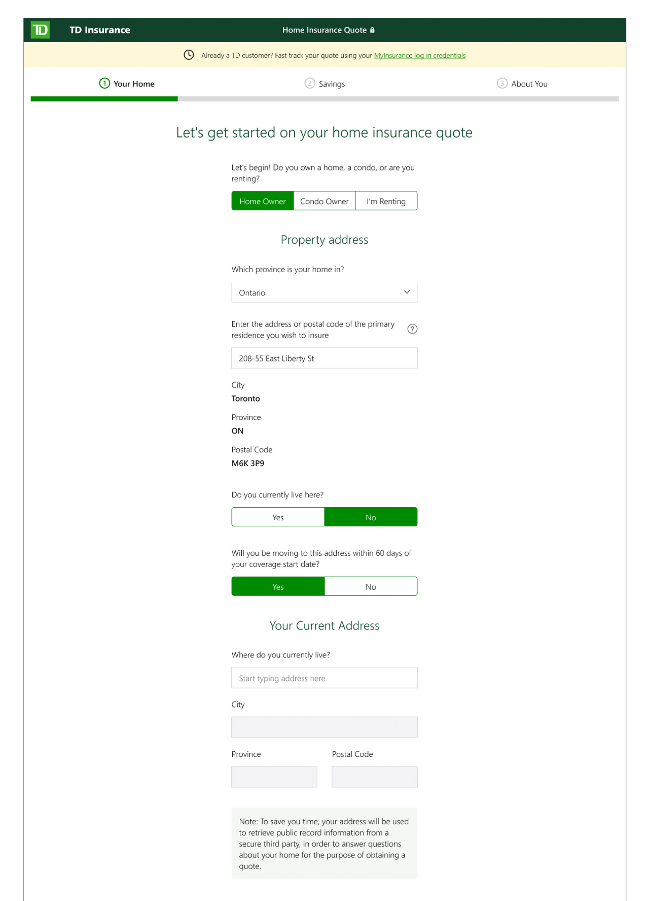
Another example is the home address page (Fig. 6-8), a seemingly straightforward step in the question flow. But like most insurance questions, it opened a can of worms that needed to account for numerous lifestyle edge cases. The typical process we followed was identifying the targeted information and working backwards to create a mini question set that felt logical to the user while still satisfying business requirements, presented in a bite-sized way, in this case through progressive disclosure.
The results
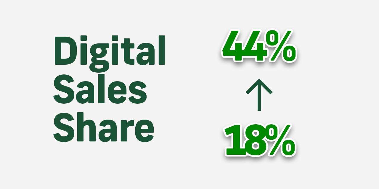
In the 5+ years I was on the TD Insurance team, we grew the percentage of insurance policies purchased online from 18% to 44%.